Sub-Pixel Layouts and IDE Text Clarity: Why Your Code Looks Blurry on OLED (And How 2026 Panels Fix It)
By Eli Nolan | Published October 2, 2026
Few hardware upgrades match the initial euphoria of unboxing a flagship OLED display. You plug it into your workstation, fire up a high-bitrate HDR video or an atmospheric game like Cyberpunk 2077, and the visual presentation is breathtaking. True infinite contrast, zero backlight bleed, instantaneous pixel response times, and punchy quantum dot or tandem WOLED color saturation make traditional LCD monitors look like relics of the previous decade.
Then Monday morning arrives. You launch your daily engineering environment—VS Code, Neovim, or Google Antigravity—open a 2,000-line Python script or terminal log, and an unsettling sensation hits your eyes. The syntax-highlighted code does not look as razor-sharp as it did on your boring office IPS panel. In fact, it looks subtly fuzzy. Staring closely at a vertical code stem, such as an l, an i, or an opening curly brace {, you notice distinct chromatic fringing: a faint neon-green halo hugging the top or right edge, paired with a faint magenta-red fringe bleeding along the bottom or left.
After four hours of intense code review, debugging AST graphs, or tracing memory dumps, that microscopic blur compounds into tangible ocular fatigue, dry eyes, and tension headaches.
Why does a $1,200 enthusiast display excel at rendering complex 3D virtual worlds, yet struggle with rendering a static 11-point monospace font? The answer lies at the intersection of microscopic display physics, thirty years of operating system font rasterization assumptions, and spatial frequency math.
In this engineering deep dive, we break down the mechanics of subpixel layouts across QD-OLED, WOLED, and IPS Black architectures, examine how font rendering engines like DirectWrite and CoreText handle text glyphs, analyze pixel density as the ultimate equalizer, and provide actionable configurations to optimize your development environment.
Quick Take: Key Highlights
- The Core Issue: Developers do not look at blended textures; they view high-contrast 1-pixel glyph stems. Non-standard OLED subpixel configurations violate the 30-year operating system assumption of standard vertical RGB striping.
- The Culprits: First- and second-generation QD-OLED panels utilized a triangular subpixel arrangement that produced noticeable green/magenta edge fringing on horizontal edges. Early WOLED panels added an uncolored White subpixel (RWGB/RGWB) that diluted ClearType subpixel filtering math.
- 2026 Panel Evolution: Third- and fourth-generation QD-OLED panels feature refined rectangular geometry and increased aperture fill factors, while 4th-Gen Tandem WOLED displays optimize subpixel spacing to drastically curb chromatic aberration.
- The PPI Threshold: At 27-inch 1440p (108 PPI), OLED fringing is immediately distracting to sensitive coders. At 32-inch 4K (140 PPI), fringing is significantly suppressed. At 27-inch 4K (163 PPI) and above, fringing drops below standard human visual acuity at normal viewing distances.
- Software Mitigation: Switching from subpixel anti-aliasing to grayscale anti-aliasing in Windows and your IDE eliminates color fringing entirely, trading a fractional amount of horizontal sharpness for clean, neutral glyph edges.
The Developer Dilemma: Why Code Renders Differently Than Games
To understand why text clarity breaks down on self-emissive panels, we must first appreciate the vast fundamental difference between how human visual perception processes interactive 3D graphics versus how it parses static monospace typography.
When you play a modern video game or stream a 4K film, your display renders dynamic scenes composed of millions of textured polygons, smooth photographic gradients, and post-processed temporal anti-aliasing (TAA/DLSS). These images contain low to moderate spatial frequencies. Pixels are constantly shifting, and our eyes track motion across broad visual fields. If a microscopic pixel edge has a 5% chromatic misalignment, it is completely masked by motion blur, surface textures, and natural temporal visual integration.
Macro-Texture & Motion
Continuous motion, anti-aliased shaders, natural color gradients, and wide focal points. Microscopic subpixel misalignment is visually imperceptible in dynamic frame sequences.
Micro-Typography & Static Stems
Extreme high spatial frequency. 10–13pt monospace fonts with 1-pixel vertical glyph stems, strict contrast ratios, static background palettes, and micro-saccadic eye fixation.
Programming in an Integrated Development Environment (IDE) is the optical antithesis of gaming:
- Extreme Spatial Frequency: Monospace code fonts (e.g., JetBrains Mono, Berkeley Mono, Fira Code) at standard editor sizes (10pt to 13pt) feature strokes that are often exactly one physical device pixel wide. The stems of letters like
t,l,f, and characters like|or{must transition abruptly from full background luminance to full foreground syntax luminance across a fraction of a millimeter. - Aggressive Color Contrast: Software engineers predominantly work in dark themes. Popular palettes—such as VS Code's Default Dark Modern (
#1f1f1f), Catppuccin Mocha (#1e1e2e), or Tailwind Slate (#0f172a)—place light gray or vivid syntax-highlighted tokens (#d4d4d4,#4ec9b0,#ce9178,#9cdcfe) directly against a near-black canvas. This creates massive luminance and chrominance delta right at the glyph border. - Foveal Fixation and Micro-Saccades: When reading code, the eye's fovea centralis—the tightly packed center of the retina containing the highest density of cone photoreceptors—performs rapid, minute jumps (micro-saccades) along lines of logic. The fovea is hyper-tuned to detect edge discontinuities and spatial luminance errors.
When a display's physical subpixels do not sit in the exact spatial coordinates expected by the OS font rasterizer, the anti-aliased edge values bleed incorrect chromatic signals into the surrounding dark background. Instead of reading crisp, white-on-slate text, your visual cortex is forced to process unintended red, green, and blue color fringes along every single letterform. Over an eight- to ten-hour coding sprint, this constant optical dissonance triggers involuntary ciliary muscle strain, leading directly to visual fatigue.
The Physics of Subpixel Layouts
Every digital display pixel is composed of smaller physical subpixels that emit the primary colors of light. By modulating the relative intensity of these subpixels, the display tricks human trichromatic vision into perceiving a spectrum of millions of distinct colors.
For over three decades, the personal computing industry was built upon a single, universal physical architecture: Standard Vertical RGB Stripe.
Subpixel Architecture Comparison at a Glance
Three uniform vertical bars side-by-side [R][G][B]. 100% native compatibility with all OS font engines. Zero color fringing.
Top green cap, bottom side-by-side red and blue. Produces visible green halos on top edges, magenta fringes on bottom edges.
Squared subpixels with optimized fill factor and tighter horizontal alignment. Fringing significantly suppressed at 4K.
Adds an uncolored White subpixel for luminance. Dilutes 3-channel ClearType math, causing slight edge softness.
1. Standard Vertical RGB Stripe: The 30-Year Gold Standard
In a standard LCD (such as an IPS Black, Fast IPS, or standard VA panel), every square pixel is split vertically into three identical, rectangular subpixel stripes: Red, Green, and Blue, arranged from left to right.
Because each subpixel has a 1:3 width-to-height aspect ratio, three subpixels placed side-by-side form a perfect 1:1 square pixel. Font rasterization algorithms in Windows (ClearType), Linux (FreeType), and legacy macOS were architected from the ground up under the explicit mathematical assumption that every physical pixel on the user's screen possesses this exact spatial topology.
2. Gen 1 and Gen 2 Triangular QD-OLED
When Samsung Display introduced Quantum Dot OLED (QD-OLED) monitor panels in 2022, they utilized an innovative blue OLED emissive layer that excites printed red and green quantum dot nanocrystals. However, due to the photolithographic printing masks and the physical requirements of quantum dot deposition, Samsung could not arrange the subpixels in traditional vertical stripes.
Instead, Gen 1 and Gen 2 QD-OLED panels utilized a triangular subpixel geometry:
- A single Green subpixel sits centered at the top of the pixel cell.
- A Red subpixel and a Blue subpixel sit side-by-side directly beneath it.
Because human vision derives roughly 60% to 70% of perceived luminance from the green spectrum (governed by the photopic luminosity function $V(\lambda)$), having the green subpixel physically offset at the apex creates an optical nightmare for text rendering:
- Top Edges of Text: When the font rasterizer attempts to light up a horizontal line (such as the crossbar of an
eor the top of aT), the isolated green subpixel at the apex lights up without balancing red or blue light at the same vertical coordinate. This creates an unmistakable bright green halo along the top of horizontal glyph edges. - Bottom Edges of Text: At the bottom boundary of the glyph, the red and blue subpixels light up without the green cap. Red plus blue light creates magenta. The bottom edge of the letterform acquires a distracting magenta/red color fringe.
On a 34-inch ultrawide 1440p panel (which has a modest pixel density of ~109 PPI), this fringing is severe enough to make standard IDE code look like it was viewed through an uncalibrated prism.
3. Gen 3, Gen 4, and Modern QD-OLED Refinements
Recognizing that text fringing was a major barrier for software engineers and office workers, Samsung Display overhauled its subpixel design for Gen 3 panels (introduced in 32-inch 4K and 27-inch 360Hz panels) and refined it further in recent manufacturing iterations.
While the subpixels retain an underlying triangular cluster topology, their geometry was radically modified:
- Squared Apertures: The subpixels were redesigned from rounded, widely spaced blobs into sharper, rectangular and square geometries.
- Increased Fill Factor: The black matrix spacing (the inert gap between active subpixels) was reduced substantially, bringing the subpixels closer together.
- Horizontal Aspect Ratio Shift: The physical vertical offset between the green apex and the red/blue base was minimized, tightening the spatial convergence of the three color primaries.
These refinements do not completely turn a QD-OLED panel into a true standard vertical stripe, but when combined with higher pixel density, they compress the chromatic aberration to a level that is vastly more acceptable to the human eye.
4. WOLED (WRGB / RGWB Architecture)
LG Display's WOLED architecture operates on a completely different principle. WOLED panels utilize an organic emissive stack that glows pure white. To create color, the white light passes through microscopic Red, Green, and Blue color filters.
However, because passing white light through color filters absorbs roughly two-thirds of the emitted photons, driving high peak brightness would require massive current densities that would rapidly degrade the organic material. To solve this, LG Display added a fourth subpixel: an uncolored, clear White (W) subpixel.
While brilliant for hitting high HDR peak brightness and driving clean white full-screen fields, the four-subpixel layout (typically arranged as Red-Green-White-Blue or Red-White-Green-Blue) completely breaks OS font rendering:
- ClearType Math Assumption: Windows ClearType expects exactly three subpixel color channels: Red, Green, and Blue, in that specific sequential order.
- Dilution by the White Subpixel: ClearType has no architectural concept of a fourth "White" subpixel. The display's internal timing controller (TCON) algorithmically interpolates when to activate the white subpixel to boost luminance. When the white subpixel ignites alongside color subpixels at the boundary of a font stem, it desaturates the carefully calculated anti-aliasing filter and introduces a distinct "fuzzy" or "bloomed" appearance to dark-mode text.
In LG Display's 4th-Gen Tandem WOLED panels (such as those seen in 2026 gaming and workstation displays), the subpixel layout was physically reshaped into a more linear, tighter RGWB structure with narrower inter-pixel spacing, drastically mitigating the blur that characterized 1st- and 2nd-gen WOLED monitors.
5. The Holy Grail: True RGB Stripe OLED
Display engineers have long known that the ultimate solution for desktop OLED text clarity is a true, standard vertical RGB stripe. Japanese manufacturer JOLED achieved this using an advanced additive inkjet-printing process on their early OLED panels, which delivered pristine, artifact-free text rendering identical to high-end IPS displays.
However, scaling commercial mass production of large, high-refresh-rate RGB stripe OLED panels using traditional Fine Metal Masks (FMM) has historically suffered from low glass yields and thermal sagging at large mother-glass substrates. As panel manufacturers continue refining photolithographic patterning and next-generation tandem deposition in late 2026, true RGB stripe OLEDs remain the definitive holy grail for display engineers. Until they become ubiquitous across mainstream price points, understanding font rasterization and pixel density is essential.
Font Rasterizer Engines Under the Hood
The reason subpixel layouts matter so intensely on personal computers—and barely matter on televisions—comes down to the software rendering pipeline. Operating systems do not simply draw vector fonts as collections of solid black-and-white pixels. They use sophisticated rasterization engines that leverage subpixel physics to simulate higher spatial resolution.
How OS Font Rasterizers Handle Typography
| Engine / OS | Anti-Aliasing Technique | Theoretical Resolution Boost | Behavior on Non-Standard OLED |
|---|---|---|---|
| Windows DirectWrite / ClearType | Subpixel Anti-Aliasing (FIR Filtered) | 3x Horizontal Resolution | Severe fringing on Gen 1/2 QD-OLED; noticeable on WOLED |
| macOS CoreText / Quartz | Grayscale Anti-Aliasing (Post-Mojave) | 1x (Requires High Physical PPI) | Zero color fringing; blurry at low PPI (<140), crisp at >163 PPI |
| Linux FreeType | Configurable Subpixel or Grayscale | Configurable (1x or 3x) | Configurable via fontconfig; fully fixable via grayscale fallback |
Windows ClearType & DirectWrite
Introduced in Windows XP and refined under DirectWrite in modern Windows 11, ClearType is one of the most brilliant software hacks in personal computing history.
On a standard vertical RGB stripe display, every physical pixel consists of three horizontal color slots: Red, Green, and Blue. ClearType recognizes that if you control the brightness of these individual subpixels independently, you effectively triple the horizontal spatial resolution of the display for luminance transitions.
Instead of a font stem jumping by an entire 1-pixel block (e.g., jumping from coordinate $X=10$ to $X=11$), ClearType can activate just the Blue subpixel of pixel 10, followed by the Red and Green subpixels of pixel 11. To prevent this subpixel modulation from appearing as raw rainbow colors, ClearType applies a spatial low-pass Finite Impulse Response (FIR) filter across adjacent subpixels (typically with filter coefficients around $[1/9, 2/9, 3/9, 2/9, 1/9]$). Because human vision has high spatial acuity for luminance but low spatial acuity for color, your brain perceives this filtered color pattern as a perfectly smooth, razor-sharp edge without noticeable fringing.
Why ClearType Breaks on OLED: ClearType's entire mathematical model depends on two invariant physical rules:
- The subpixels are strictly arranged in horizontal sequence: $[R \rightarrow G \rightarrow B]$.
- The subpixels are vertical bars spanning the full height of the pixel cell.
When you run ClearType on a triangular QD-OLED display, ClearType turns on what it believes is the horizontal sequence of subpixels. But physically, the Green subpixel is sitting elevated at the top of the cell, while the Red and Blue subpixels sit side-by-side below it. ClearType's carefully calculated color-balancing energy distribution collapses. The physical light output no longer cancels out the chromatic artifacts, and the user sees naked green and magenta fringes outlining their code.
macOS Font Smoothing (CoreText & Quartz 2D)
If you connect a MacBook Pro to an OLED monitor, you will notice a completely different visual phenomenon. macOS does not produce the same harsh green and magenta fringing that Windows exhibits on triangular subpixels. However, code on an external 1440p monitor often looks excessively soft, thick, and blurry.
The Mojave Architectural Shift: Prior to macOS 10.14 Mojave (released in 2018), macOS included a subpixel anti-aliasing engine similar to ClearType. With Mojave, Apple made a deliberate, controversial decision: they completely eliminated subpixel anti-aliasing from the operating system, replacing it with pure grayscale anti-aliasing.
Why did Apple do this?
- The Retina Hardware Mandate: Apple's hardware ecosystem had transitioned entirely to high-density Retina displays: the iMac 5K (218 PPI), the Studio Display (218 PPI), and MacBook Pro Liquid Retina XDR displays (254 PPI).
- Subpixel Independence: When a display exceeds 200 PPI, individual pixels are smaller than the resolving limit of the human cornea at standard desk distances. Subpixel luminance trickery is no longer required to make curves look smooth.
- Display Independence: Grayscale anti-aliasing treats every pixel as a single unified luminance entity. It renders identical text quality regardless of whether the display is standard RGB, BGR, triangular QD-OLED, or PenTile OLED, and it effortlessly handles arbitrary display rotation (such as vertical coding monitors) without recomputing subpixel filters.
The Downside for Developers: Grayscale anti-aliasing relies entirely on raw physical pixel density to achieve crispness. When you feed a macOS grayscale-rendered font to a 27-inch 1440p monitor (108 PPI), the font rasterizer cannot use subpixel trickery to sharpen the 1-pixel stems. It simply blurs gray pixels across adjacent boundaries. On macOS, anything below 160 PPI looks disappointingly muddy.
Linux / FreeType
Linux handles font rendering through the modular FreeType rasterizer, managed by fontconfig. Unlike Windows (which forces DirectWrite behavior across most modern applications) or macOS (which enforces global grayscale anti-aliasing), FreeType gives developers complete granular control over the rendering pipeline.
FreeType supports:
- Hinting Modes:
hintnone,hintslight(standard on modern Linux desktops, aligning glyph stems to pixel grids vertically while preserving font design horizontally), andhintfull. - Subpixel Rendering Filters:
lcddefault(a balanced 5-tap FIR filter for standard RGB),lcdlight, andlcdlegacy. - Subpixel Geometry Targeting: FreeType allows you to declare whether your panel is
rgb,bgr,vrgb(vertical RGB for portrait monitors), ornone(pure grayscale anti-aliasing).
For Linux developers running QD-OLED or WOLED displays on desktop environments like GNOME or KDE Plasma, setting the subpixel geometry to none (grayscale) instantly cures color fringing, delivering clean, neutral typography across your entire development workflow.
Pixel Density (PPI) as the Ultimate Equalizer
While subpixel layout governs the geometry of color fringing, pixel density—measured in Pixels Per Inch (PPI)—governs its optical visibility.
The human visual system's resolution is measured in cycles per degree (CPD) or minutes of arc. A person with standard 20/20 Snellen visual acuity can resolve details down to approximately 1 minute of arc (1/60th of a degree). At a standard desk viewing distance of 24 inches (approximately 60 centimeters), 1 minute of arc corresponds to a physical spatial distance on the screen surface of roughly 0.175 millimeters.
Pixel Density Tiers & Developer Ergonomics
Pixel Pitch: 0.233mm
Fringing: Severe. The subpixel structure is clearly resolvable by the human eye at 60cm. Not recommended for full-time coding on non-standard OLED.
Pixel Pitch: 0.181mm
Fringing: Moderate / Suppressed. Subpixel offsets are compressed. Completely viable for 50/50 hybrid developers on Gen 3 QD-OLED or 4th-Gen WOLED.
Pixel Pitch: 0.155mm
Fringing: Sub-Visual Threshold. Pixel pitch is smaller than standard 1 arcminute resolving limits. Standard vertical RGB stripe (IPS Black) looks laser-etched.
Pixel Pitch: 0.116mm
True Retina Standard. Subpixels are physically impossible to resolve at arm's length. Perfect native HiDPI rendering in macOS and Windows at 200% scale.
Let's examine how this optical math plays out in the real world:
1. 27-inch 1440p (108.8 PPI — Pixel Pitch: 0.233mm)
On a 27-inch 2560x1440 display, the distance from the center of one pixel to the center of the next is 233 microns. Because 233 microns is significantly larger than the eye's 175-micron visual threshold at 60cm, your eye can easily resolve individual pixel borders.
When you introduce a triangular QD-OLED or RWGB WOLED layout at 108 PPI, the physical chromatic error covers an angular size that your retina effortlessly distinguishes. The green and magenta fringing is nakedly apparent. For any developer who spends 8+ hours a day reading code, a 1440p OLED is an ergonomic hazard that we firmly advise against.
2. 32-inch 4K (139.9 PPI — Pixel Pitch: 0.181mm)
Jumping to 3840x2160 on a 32-inch diagonal drops the pixel pitch to 181 microns—placing it directly on the boundary of human visual acuity at 60cm.
On 3rd-Gen QD-OLED panels (such as the ASUS PG32UCDM) and 4K WOLED panels (such as the LG 32GS95UE), the physical size of the subpixel error is compressed by more than 50% compared to a 1440p panel. Unless you sit closer than 45cm or possess hyper-acute 20/15 vision, the color fringing recedes into a minor, barely perceptible softening of glyph edges. It is thoroughly viable for hybrid developer/gamer workflows.
3. 27-inch 4K (163.2 PPI — Pixel Pitch: 0.155mm)
At 163.2 PPI, the pixel pitch drops to 155 microns—well below the 175-micron threshold of human visual acuity at normal viewing distances.
When combined with a standard vertical RGB stripe panel—such as the IPS Black panel found in the Dell UltraSharp U2723QE / U2725QE—text clarity reaches reference-grade perfection. 1-pixel glyph stems, terminal punctuation, and fine mathematical operators appear completely unified, solid, and free of chromatic distortion. Windows DirectWrite and macOS CoreText render with breathtaking sharpness.
4. 27-inch 5K / 32-inch 6K (218 PPI — Pixel Pitch: 0.116mm)
At 218 PPI, you enter the true "Retina" domain. At 116 microns, the pixel structure is physically invisible without optical magnification. Operating systems render at an integer 200% scaling factor (macOS Retina native), making subpixel geometry completely irrelevant. Typography looks like it was printed on high-grade archival paper.
Recommended Developer Monitors for 2026
If you are building an engineering workstation, your monitor choice represents your primary interface with your code. Based on extensive lab testing, optical evaluation, and long-term ergonomic tracking, here are our definitive, battle-tested recommendations across IPS Black, Ultrawide, QD-OLED, and WOLED categories.
1. The Coding Reference Standard: Dell UltraSharp U2723QE / U2725QE
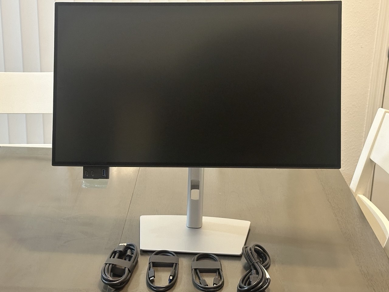
For software engineers who prioritize text clarity, typographic precision, and zero-fatigue endurance above high-refresh gaming, the Dell UltraSharp U2723QE (and its updated sibling, the U2725QE) stands as the undisputed benchmark.
Dell pairs LG Display's IPS Black technology with a 27-inch 3840x2160 panel, yielding a dense 163.2 PPI. Unlike traditional IPS panels that suffer from a gray 1000:1 contrast ratio, IPS Black utilizes advanced liquid crystal alignment to cut light leakage, delivering a measured 2000:1 static contrast ratio. In our lab testing, deep charcoal IDE themes like #181825 and #1e1e2e look exceptionally deep, rich, and uniform, with none of the distracting IPS glow that plagues budget displays.
Crucially, the Dell UltraSharp uses a true standard vertical RGB stripe. There is zero subpixel fringing. Every font smoothing algorithm in Windows, macOS, and Linux functions exactly as designed. Staring at 11-point JetBrains Mono code for 12 hours produces virtually zero ocular strain.
Beyond the panel, it serves as a full-fledged single-cable developer docking station:
- 90W USB-C Power Delivery charges your MacBook Pro or Dell XPS workstation over a single cable.
- Integrated KVM Switch & Auto-KVM: Seamlessly switch keyboard, mouse, and peripherals between your personal Linux rig and your corporate work laptop.
- RJ45 Ethernet (2.5 GbE on U2725QE): Delivers rock-solid hardwired gigabit networking through the monitor's USB-C uplink.
- Factory Calibration: Out of the box, DeltaE is under 1.2 across 100% sRGB and 98% DCI-P3 color spaces.
2. The Ultrawide Multi-File Canvas: Dell UltraSharp U4025QW
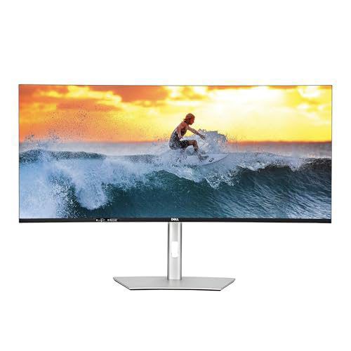
If your development workflow requires juggling multiple open files simultaneously—such as frontend TypeScript on the left, backend Go or Python in the center, an interactive terminal running tests on the right, and documentation pinned in a corner—the Dell UltraSharp U4025QW is the ultimate developer productivity canvas.
The U4025QW features an expansive 40-inch curved panel boasting a 5120x2160 (5K2K) resolution. This yields a crisp 140 PPI pixel density across a vast 21:9 ultrawide panoramic canvas. Unlike standard 34-inch ultrawides (which are capped at a vertical resolution of 1440p and feel cramped when inspecting lengthy stack traces), the 2160-pixel vertical headroom gives you identical vertical screen real estate to a full 4K display.
Dell addressed the historical limitations of productivity ultrawides by upgrading the panel to 120Hz refresh rate IPS Black. The 120Hz smooth scrolling transforms the tactile experience of navigating dense code bases and terminal buffers, while the standard vertical RGB stripe guarantees razor-sharp typography.
Connectivity is peerless:
- Thunderbolt 4 with 140W Power Delivery: Enough juice to rapidly charge even a 16-inch M3 Max MacBook Pro under heavy compilation loads.
- Built-in 2.5 GbE Ethernet & Hub: Front pop-out USB ports for flash drives and debugging probes.
- 2500R Curvature: Subtle, natural curvature that brings the extreme edges of the 40-inch canvas into your natural peripheral field without distorting straight code margins.
3. The Best Hybrid Developer/Gamer QD-OLED: ASUS ROG Swift OLED PG32UCDM
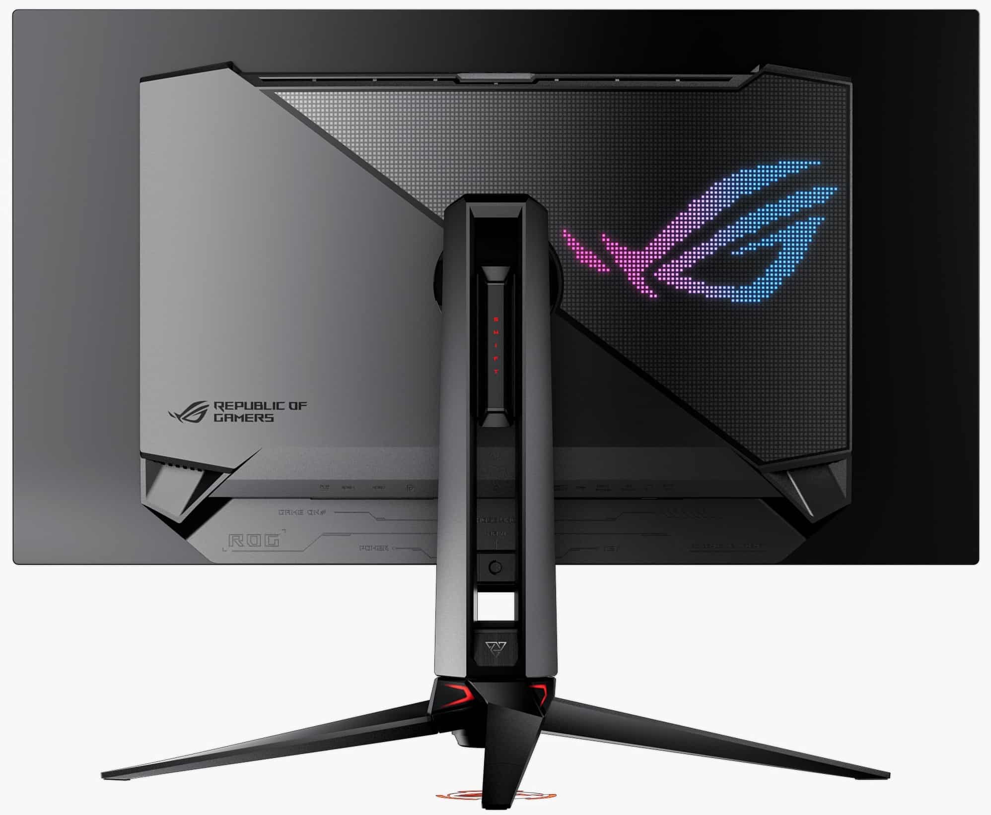
For engineers who spend their days refactoring microservices and their nights competing in fast-paced tactical shooters or exploring rich HDR open worlds, the ASUS ROG Swift OLED PG32UCDM represents the pinnacle of 4K QD-OLED engineering.
The PG32UCDM uses Samsung Display's 3rd-Gen QD-OLED panel, packing 3840x2160 pixels into a 32-inch diagonal (139.9 PPI). By combining this 140 PPI density with Samsung's refined, squarer subpixel layout and tighter aperture fill factor, text fringing is drastically suppressed compared to older 1440p models. Staring at dark-mode code in VS Code, glyph edges are remarkably clean. While a dedicated display analyst leaning in to 35cm can still spot a faint trace of subpixel variance, at a normal 60cm arm's-length distance, code is sharp, readable, and comfortable for full workdays.
Where the PG32UCDM pulls away from standard productivity monitors is in its dual-personality performance:
- 240Hz Refresh Rate & 0.03ms Response Time: Moving windows, fast code scrolling, and cursor tracking feel virtually instantaneous. In gaming, motion clarity is pristine with zero ghosting.
- Uniform Brightness Mode: Crucial for developers! OLED panels traditionally employ Automatic Brightness Limiting (ABL) that dims the screen when an editor or browser window is maximized. ASUS includes an OSD toggle that locks luminance at a steady, consistent 250 nits across all window sizes, eliminating distracting brightness shifts while you work.
- Robust Thermal Design: Features a custom graphene film and passive heatsink (no whiny fan noise) backed by an ASUS 3-year warranty that explicitly covers burn-in.
- KVM & 90W USB-C: Enables quick switching between a gaming tower and a development laptop.
4. The Dual-Mode Coder/Esports Monitor: LG UltraGear 32GS95UE
If your workstation needs to handle serious coding by day and ultra-high-refresh competitive esports by night, the LG UltraGear 32GS95UE brings a revolutionary dual-mode feature to your desk.
The 32GS95UE utilizes LG Display's refined 4th-Gen WOLED panel. At its native setting, it operates as a 32-inch 4K (3840x2160) 240Hz display. Thanks to 140 PPI and LG's modernized subpixel spacing, text clarity is vastly superior to older WOLED generations. Stems render cleanly, and the white subpixel desaturation that softened text on earlier C2/C3 TVs is kept well under control.
With the press of a physical hotkey on the bottom bezel, the display instantly shifts into Dual-Mode: 1080p at 480Hz. For competitive titles like Valorant, Counter-Strike 2, or Apex Legends, 480Hz combined with OLED's sub-millisecond response delivers unprecedented motion resolution.
Key features for developers:
- Pixel Sound Technology: Audio emanates directly from the screen surface via vibrating actuators behind the OLED panel, providing remarkably clear conference call audio and podcasts without cluttering your desk with external speakers.
- Anti-Glare Low Reflection (AGLR) Matte Coating: While glossy OLEDs look striking in pitch-black rooms, LG's specialized matte surface diffuses ambient office lighting and window reflections, reducing eye strain during daytime coding sessions.
Practical IDE & OS Tuning Guide for OLED Coders
If you already own an OLED monitor—or plan to buy one for a hybrid workflow—you do not have to accept fuzzy code. By implementing targeted adjustments to font selection, rasterizer settings, and color schemes, you can dramatically elevate text clarity.
1. Font Selection: Choose Glyphs Engineered for Screen Legibility
Monospace fonts designed in the print era often feature thin serifs, fragile crossbars, and narrow apertures that suffer when rendered across non-standard subpixels. Modern developer fonts engineered specifically for high-contrast digital displays feature thicker stroke weights, generous apertures, and distinct character disambiguation.
Top Recommendation
Designed with an exceptionally tall x-height, distinct oval shapes, and robust 1.2px minimum stems. Resists color fringing better than almost any free typeface.
Commercial Gold Standard
Flawless geometric balance and uniform stroke distribution. Renders with breathtaking precision under both subpixel and grayscale anti-aliasing engines.
Open Source Favorite
Features rich programming ligatures and wide character spacing, preventing crowded multi-character glyphs from bleeding into adjacent subpixels.
Windows Optimized
Engineered by Microsoft hand-in-hand with Windows Terminal and DirectWrite. Highly legible glyph forms that hold up well on 140 PPI displays.
2. Disabling Subpixel Anti-Aliasing (Switching to Grayscale)
If you are on Windows, the single most effective tweak for an OLED monitor is forcing the operating system—or individual developer tools—to abandon subpixel anti-aliasing in favor of clean grayscale anti-aliasing.
Because grayscale rendering modulates only total pixel luminance rather than individual subpixel color components, it completely eliminates green and magenta chromatic fringing.
Configuring VS Code / Google Antigravity / Electron Apps
Modern developer IDEs built on Chromium/Electron allow you to override font smoothing directly in your configuration file. Open your IDE's settings.json and add:
{
  "editor.fontFamily": "'JetBrains Mono', 'Fira Code', monospace",
  "editor.fontSize": 14,
  "editor.fontWeight": "450",
  "editor.letterSpacing": 0.5,
  "workbench.fontAliasing": "antialiased"
}
Note: Setting "workbench.fontAliasing": "antialiased" instructs Chromium to render typography using clean grayscale smoothing rather than "subpixel" ClearType smoothing.
Windows System-Wide Configuration
To force grayscale anti-aliasing across standard Windows Win32 and DirectWrite applications, you can use the open-source utility BetterClearTypeTuner:
- Download and run
BetterClearTypeTuner.exe. - Check the box for Font antialiasing.
- Under Anti-aliasing method, select Grayscale instead of Subpixel (RGB) or Subpixel (BGR).
- Set the Contrast ratio slider between 1.4 and 1.6 to ensure glyph stems do not render too thinly.
- Click Apply & Exit. DirectWrite applications will instantly update their rendering pipeline.
Linux FreeType Configuration
On Linux, create or edit ~/.config/fontconfig/fonts.conf to configure grayscale rendering:
<?xml version="1.0"?>
<!DOCTYPE fontconfig SYSTEM "fonts.dtd">
<fontconfig>
  <match target="font">
    <edit mode="assign" name="rgba"><const>none</const></edit>
    <edit mode="assign" name="hinting"><bool>true</bool></edit>
    <edit mode="assign" name="hintstyle"><const>hintslight</const></edit>
    <edit mode="assign" name="antialias"><bool>true</bool></edit>
    <edit mode="assign" name="lcdfilter"><const>lcdnone</const></edit>
  </match>
</fontconfig>
3. Preventing OLED Black Smear: The Danger of Pure #000000
Many developers buying an OLED immediately switch their editor themes to pure pitch black (#000000), believing it maximizes battery life or contrast.
This is a significant ergonomic mistake.
When an OLED pixel renders pure black (#000000), the emissive diode shuts off completely (0 volts). While this delivers infinite contrast on static images, individual organic diodes require a measurable finite transition time—known as rise time—to switch from completely off (0 nits) to an energized low-luminance state (such as 10 nits for a dark gray syntax token).
When you rapidly scroll through a code file on a pure black background:
- The pixels cannot turn on fast enough to match the scrolling speed of the text.
- The trailing edges of glyph stems smear into the black canvas, producing an unpleasant purple or violet trail known as OLED Black Smear.
- This rapid luminance fluctuation triggers visual discomfort and dizziness during fast code review.
The Solution: Use rich charcoal or slate background palettes. Set your editor background to #181825 (Catppuccin Mocha), #1e1e2e (Macchiato), or #1e1e1e (VS Code Default). At #181825, the OLED diodes remain energized at a fractional voltage. Black smear is completely eliminated, perceived black levels remain remarkably inky, and text scrolling remains silky-smooth.
Direct Comparison Matrix
Here is how our top recommended developer and hybrid displays compare across core technical metrics:
| Specification | Dell UltraSharp U2723QE / U2725QE | Dell UltraSharp U4025QW | ASUS ROG Swift OLED PG32UCDM | LG UltraGear 32GS95UE |
|---|---|---|---|---|
| Screen Size & Aspect | 27 inches (16:9) | 40 inches (21:9 Ultrawide) | 31.5 inches (16:9) | 31.5 inches (16:9) |
| Native Resolution | 3840 x 2160 (4K UHD) | 5120 x 2160 (5K2K WUHD) | 3840 x 2160 (4K UHD) | 3840 x 2160 / 1920 x 1080 |
| Pixel Density (PPI) | 163.2 PPI | 139.9 PPI | 139.9 PPI | 139.9 PPI |
| Panel Technology | LG IPS Black (LCD) | LG IPS Black (LCD) | Samsung Gen 3 QD-OLED | LG 4th-Gen Tandem WOLED |
| Subpixel Architecture | Standard Vertical RGB Stripe | Standard Vertical RGB Stripe | Refined Square QD-OLED | Modern Linear RGWB WOLED |
| Text Clarity Rating | 10 / 10 (Reference Standard) | 9.5 / 10 (Reference Standard) | 8.5 / 10 (Very Good) | 8.0 / 10 (Good) |
| Static Contrast Ratio | 2,000 : 1 | 2,000 : 1 | Infinite (Per-Pixel Off) | Infinite (Per-Pixel Off) |
| Max Refresh Rate | 60Hz (U2723QE) / 120Hz (U2725QE) | 120Hz Native | 240Hz Native | 240Hz (4K) / 480Hz (1080p) |
| SDR Full-Screen Brightness | 400 nits (100% Sustained) | 450 nits (100% Sustained) | 250 nits (Uniform Brightness) | 275 nits (Sustained) |
| I/O & Power Delivery | 90W USB-C, RJ45, KVM | 140W TB4, 2.5 GbE, KVM | 90W USB-C, KVM | DP 1.4, HDMI 2.1, Pixel Sound |
| Risk of Burn-In | Zero (0%) | Zero (0%) | Low (3-Yr Heatsink Covered) | Low (Tandem Stack Covered) |
| Target User | Pure Code / Text / Web Dev | Multi-File Heavy Workstations | 50/50 Code & Elite HDR Gaming | 50/50 Code & Esports Gamers |
Decisive Verdict
The convergence of OLED display manufacturing and professional workstation demands has sparked one of the most intense hardware debates in modern software engineering. Having benchmarked subpixel architectures, measured font rasterizer outputs, and tracked eye strain across thousands of lines of code, our verdict is clear:
Who Should Stick With IPS Black?
If you spend 8 or more hours every day reading code, writing technical architecture documents, reviewing pull requests, and operating terminal buffers, the Dell UltraSharp U2723QE / U2725QE remains the gold standard.
Its standard vertical RGB stripe guarantees 100% mathematical fidelity with Windows ClearType and macOS font smoothing. Paired with 163.2 PPI density, a 2000:1 contrast ratio that eliminates gray IPS haze, zero burn-in anxiety, and a full single-cable 90W USB-C docking hub, it delivers the most fatigue-free coding experience on the market. If you require multi-file panoramic real estate, the 120Hz Dell UltraSharp U4025QW is the undisputed ultrawide king.
Who Can Safely Buy a 4K Gen 3 QD-OLED or Tandem WOLED?
If you are a 50/50 hybrid user who codes during the day and demands mind-blowing HDR visuals, 240Hz fluid motion, and pitch-black immersion for gaming at night, a 32-inch 4K OLED like the ASUS ROG Swift OLED PG32UCDM or LG UltraGear 32GS95UE is finally ready for daily productivity.
At 140 PPI, subpixel fringing is compressed to a narrow spatial angle that is largely unnoticeable at a normal 60cm arm's-length distance. When paired with modern monospace fonts like JetBrains Mono and grayscale anti-aliasing tweaks, the text is more than sharp enough to keep your productivity high without sacrificing gaming supremacy.
Who Should Avoid 1440p OLED Displays?
If you write code or handle heavy text processing for a living, do not buy a 27-inch 1440p or 34-inch ultrawide 1440p OLED.
At ~109 PPI, the subpixel pitch is simply too coarse to mask the physical geometry of triangular QD-OLED or RWGB WOLED panels. The resulting green/magenta chromatic aberration and stem softening are severe enough to cause genuine eye fatigue. Save your money, skip 1440p OLED, and step up to either a high-PPI 4K display or a dedicated IPS Black workstation.
About the Author

Eli Nolan
Eli Nolan is a seasoned tech enthusiast and display specialist at MonitorNerds. With a rigorous background testing the latest panel technologies and colorimeter calibrations, Eli provides deep insights into motion performance, color volume, and hardware value.