Best Adobe RGB Monitors in Modern Workflows: Why Your 99% P3 Display Fails Print
By Eli Nolan | Published October 7, 2026
If you have spent any time evaluating high-end creative monitors over the past few years, you have undoubtedly noticed a dramatic shift in how manufacturers market display gamuts. Open up the technical spec sheet of almost any modern creative display—whether it is an Apple Liquid Retina XDR MacBook Pro, a flagship 4K QD-OLED gaming panel, or a high-end designer monitor—and you will be greeted by the exact same bold marketing badge: "99% DCI-P3 Wide Color Gamut."
For digital cinematographers, streaming colorists, and UI/UX designers building mobile applications for iOS and Android, this widespread adoption of DCI-P3 (and its consumer derivative, Display P3) has been a genuine triumph. But for commercial photographers, fine-art printmakers, prepress retouchers, and packaging designers, it has quietly created one of the most frustrating, costly, and misunderstood technical traps in modern desktop computing.
Here is the scenario we hear constantly from readers: A seasoned photographer invests thousands of dollars in a cutting-edge "wide gamut" display boasting 99% P3 coverage and a factory calibration sheet claiming a $\Delta E < 2.0$. They edit their high-resolution RAW files, meticulously balance tone curves in Adobe Lightroom Classic or Photoshop CC, and send the proof to an archival fine-art pigment printer like an Epson SureColor P900 or Canon imagePROGRAF PRO-1000 loaded with 10 to 12 individual pigment inks.
The physical print rolls off the paper tray onto heavy 308 gsm cotton rag. But instead of the breathtaking, luminous image seen on screen, the physical print looks fundamentally wrong. Saturated turquoise sea water has collapsed into a muddy, dull cyan. Rich emerald moss and pine foliage appear flat and lifeless. Subtle aqua-to-blue sky gradients are scarred by harsh digital posterization and banding steps.
The photographer assumes their printer profile is corrupted, their print head is misaligned, or their paper batch is defective. In reality, the culprit is sitting right in front of them: Their 99% DCI-P3 monitor physically cannot display the color gamut that their printer can easily lay down on paper.
In our foundational industry catalog, The Best Adobe RGB Monitors for Editing Buying Guide, we surveyed the complete hardware landscape across every size and price bracket. In this technical follow-up guide, we pull back the curtain on the underlying color science. We examine the mathematics behind the "Cyan Trap," dissect the architectural differences between Hardware 3D LUTs and GPU 1D video LUTs, lay out a bulletproof soft-proofing and darkroom viewing protocol (ISO 3664), and benchmark the finest 99% Adobe RGB hardware reference monitors available in 2026.
Quick Take: Key Highlights
80%–86% Adobe RGB Coverage
A 99% DCI-P3 monitor covers only ~80% to 86% of the Adobe RGB color space. DCI-P3 expands into theatrical reds and yellows, but completely truncates the deep cyans, aquas, and emerald greens native to CMYK offset and 12-ink pigment printing.
Hardware 3D LUT vs. GPU VCGT
Software calibration writes 1D gamma curves into the GPU’s 8-bit or 10-bit video LUT, causing quantization banding and hue shifts. Hardware 3D LUTs write directly to an internal 16-bit scaler ASIC, correcting non-linear color cross-talk with zero digital loss.
Soft-Proofing & ISO 3664
Accurate print matching requires custom ICC paper profiles, Perceptual vs. Relative Colorimetric rendering intent management, display luminance calibrated down to 80–120 cd/m², and D50 viewing booths with shaded monitor hoods to kill optical flare.
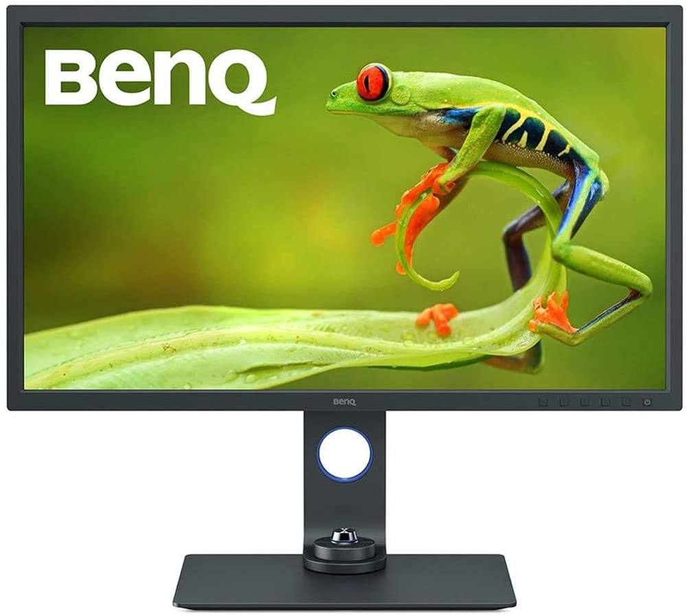
BenQ SW321C PhotoVue
Equipped with a 16-bit 3D LUT, ART anti-reflective coating, Paper Color Sync, Hotkey Puck G2, and an included velvet-lined shading hood, the BenQ SW321C remains the gold-standard reference monitor for print professionals.
The Color Space Dilemma & The Cyan Trap: Adobe RGB vs. DCI-P3
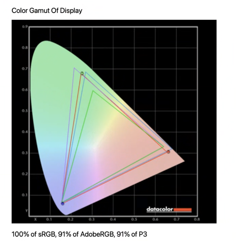
To understand why a 99% DCI-P3 monitor fails commercial printmakers, we must examine the physical origins and chromaticity coordinates of these two color spaces. Color gamuts are not arbitrary geometric shapes drawn by software developers; they are mathematical boundaries defined on the CIE 1931 Chromaticity Diagram, derived from the spectral sensitivity of human retinal cone photoreceptors.
The Cinematic Origins of DCI-P3
In 2005, the Digital Cinema Initiatives (DCI)—a joint venture formed by major Hollywood studios including Disney, Warner Bros., Sony Pictures, and Universal—published the SMPTE EG 432-1 and SMPTE RP 431-2 standards. Their objective was to standardize the color reproduction of theatrical digital cinema projectors.
The engineering team designed the DCI-P3 color space around the physical spectral emission characteristics of industrial xenon arc projection lamps shining through digital micromirror devices (DLP cinema projectors) inside pitch-black theatrical auditoriums. The original theatrical standard mandated:
- A correlated color temperature (CCT) of approximately 6300K (Theater White: x = 0.314, y = 0.351), which accounted for the native yellowish tint of xenon arc lamps.
- A pure power-law transfer function of Gamma 2.6, calibrated for dark ambient viewing environments (typically 48 cd/m² or 14 foot-lamberts peak theatrical luminance).
- A gamut boundary heavily shifted toward the yellow, orange, and red quadrants of the chromaticity diagram.
Hollywood's primary creative priorities were the reproduction of warm, lifelike human skin tones, golden-hour outdoor sunlight, explosions, fire, and deep crimson fabrics. Cinematic projection rarely demands the hyper-saturated, chemical cyans found in industrial textiles or glossy architectural offset printing.
When Apple popularized this color space across the consumer electronics market with the launch of the iMac with Retina 4K/5K displays and iPhones, they created the Display P3 variant. Display P3 uses the exact same physical Red, Green, and Blue primary chromaticities as DCI-P3, but substitutes the standard computer white point of Illuminant D65 (6504K: x = 0.3127, y = 0.3290) and utilizes the standard sRGB electro-optical transfer function (EOTF) to maintain consistency with operating system UI rendering.
The Offset Prepress Mandate of Adobe RGB (1998)
Seven years prior to the creation of DCI-P3, display engineers faced a completely different challenge. In 1998, Thomas Knoll (co-creator of Adobe Photoshop) and Adobe Systems recognized that the standard consumer color space—sRGB, created jointly by HP and Microsoft in 1996—was catastrophic for commercial printing.
While sRGB was perfectly tuned to match the phosphors of consumer CRT computer monitors and early web browsers, it was severely undersized. High-end commercial four-color offset printing presses using standard CMYK inks (Cyan, Magenta, Yellow, and Key/Black) were physically capable of printing rich, saturated cyan, aqua, and emerald tones that fell far outside the sRGB triangle.
When graphic designers converted sRGB images into CMYK separation plates for web offset presses (such as the SWOP standard in North America or FOGRA39 / FOGRA51 in Europe), the saturated cyan pigments of the physical inks were completely starved. Designers were unable to preview or utilize the full chromatic potential of physical ink on coated paper.
To solve this, Adobe engineered Adobe RGB (1998). Adobe chose the primary chromaticities specifically so that the resulting color space triangle would fully encompass the entire theoretical color volume of a standard CMYK offset printing press operating on coated paper (such as GRACoL 2006/2013 and ISO 12647-2).
Think of the CIE 1931 Chromaticity Diagram (the colorful horseshoe chart shown above) as a 2D map of all colors visible to human eyes. Every color space—like sRGB, Adobe RGB, or DCI-P3—is a triangle plotted onto this map. The (x, y) coordinates are simply the map coordinates for the three corner points of that triangle (Red, Green, and Blue). Whatever lies inside the triangle is the range of colors a monitor can show. Where those corners reach determines what hues you can actually see.
| Color Space Specification | Red Corner (x, y) | Green Corner (x, y) | Blue Corner (x, y) | Reference White Point | Target Gamma | Visible Spectrum Area | Primary Target Industry |
|---|---|---|---|---|---|---|---|
| sRGB | (0.6400, 0.3300) | (0.3000, 0.6000) | (0.1500, 0.0600) | 6504K (D65 Daylight) | ~2.2 (sRGB Curve) | ~35.9% | Standard Web, Office & SDR Gaming |
| Adobe RGB (1998) | (0.6400, 0.3300) | (0.2100, 0.7100) | (0.1500, 0.0600) | 6504K (D65 Daylight) | Pure Power 2.20 | ~52.1% | Commercial Photography & Print Prepress |
| DCI-P3 (SMPTE) | (0.6800, 0.3200) | (0.2650, 0.6900) | (0.1500, 0.0600) | 6300K (Theater White) | Pure Power 2.60 | ~53.6% | Hollywood Theatrical Cinema & HDR |
| Display P3 (Apple) | (0.6800, 0.3200) | (0.2650, 0.6900) | (0.1500, 0.0600) | 6504K (D65 Daylight) | ~2.2 (sRGB Curve) | ~53.6% | Mac, iPhone, Modern Web & Mobile UI |
Look closely at the Green Corner coordinates in the table above:
- sRGB: x = 0.3000, y = 0.6000
- DCI-P3: x = 0.2650, y = 0.6900
- Adobe RGB: x = 0.2100, y = 0.7100 (Deep Cyan / Emerald)
Notice how the green corner of Adobe RGB is pulled much farther to the left (x = 0.2100) and higher up (y = 0.7100). On the color map, moving in that direction stretches the triangle deep into pure cyans, turquoise ocean blues, and emerald greens—which is exactly where physical printer inks operate!
By contrast, DCI-P3 pushes its red corner farther right (x = 0.6800), giving it richer movie-theater reds, warm sunsets, and oranges, but cutting off the saturated cyans that fine-art printers require.
The Cyan Trap Quantified
Because DCI-P3 and Adobe RGB occupy roughly similar total surface areas on the CIE 1931 horseshoe (53.6% vs. 52.1%), aggressive marketing teams treat them as interchangeable "wide gamut" standards. They are not.
A display advertising 99% DCI-P3 coverage will only cover approximately 80% to 86% of the Adobe RGB color space. That missing 14% to 20% of color volume is not distributed evenly across the spectrum; it is concentrated entirely in an aggressive triangular slice of rich cyans, aquas, teals, turquoise waters, and vibrant emerald greens.
If you are a portrait photographer delivering high-res JPEG files for social media and web portfolios, a 99% DCI-P3 screen is extraordinary. Skin tones lie squarely in the yellow-red sector where DCI-P3 excels.
However, if your creative discipline touches physical pigment printing, the Cyan Trap becomes a disaster:
- Fine-Art Landscape & Travel Photography: Ocean surf, glacial lakes, tropical reefs, peacock feathers, alpine moss, and twilight skies exist precisely in the cyan-green spectral gap between DCI-P3 and Adobe RGB.
- Modern Pigment Inkjet Printing: Archival 10-ink and 12-ink pigment printers (such as the Epson UltraChrome PRO12 engine in the SureColor P7570/P9570 or the Canon LUCIA PRO inkset in the imagePROGRAF PRO-1100/PRO-2100) do not rely solely on standard CMYK. They feature dedicated, pure Cyan, Light Cyan, Photo Cyan, Green, and Violet pigment cartridges. These physical inks easily exceed the cyan boundary of DCI-P3 on premium fine-art papers like Hahnemühle Photo Rag Baryta or Canson Platine Fibre Rag.
- The Editing Blindspot: When you edit a RAW photo on a 99% DCI-P3 display, the monitor hardware cannot physically illuminate those saturated cyan coordinates. The operating system's color management engine clips those out-of-gamut shades to the display's maximum P3 edge. Thinking the cyan water looks dull, you aggressively crank the Saturation or Vibrance slider in Lightroom. When that file is sent to your 12-ink pigment printer, the printer reads the true underlying digital code values, resulting in oversaturated, radioactive, posterized cyan ink splatters that ruin expensive paper.
To avoid flying blind, prepress professionals and commercial printmakers require a dedicated 99% Adobe RGB panel. For an exhaustive breakdown of the market's leading options across multiple budgets, consult our comprehensive buying index: The Best Adobe RGB Monitors for Editing Buying Guide.
Hardware 3D LUT vs. Software 1D GPU Video LUT (vcgt)
Beyond gamut coverage, there is a secondary hardware requirement that separates true professional print reference monitors from ordinary wide-gamut displays: how color calibration is executed and stored.
Many creative professionals purchase a modern wide-gamut monitor, connect a colorimeter like the Calibrite Display Plus HL or Datacolor SpyderX Pro, run standard calibration software (such as DisplayCAL or Calibrite PROFILER), and believe their monitor is now hardware-calibrated. In 95% of cases, it is not. They have executed a software calibration.
1D GPU Video LUT (vcgt)
- Calibration curves written to GPU VRAM gamma ramps.
- Three independent 1D channels (Red, Green, Blue) with no cross-channel correction.
- Quantization truncation: discards code values, creating visible gradient banding.
- Prone to OS reset bugs, driver crashes, and fullscreen game overrides.
- Tied exclusively to the host PC; reset when changing inputs.
Internal 16-Bit 3D LUT ASIC
- Calibration data written directly to the monitor's internal scaler chip.
- 3D volumetric mesh (17×17×17 or 33×33×33 lattice) resolves non-linear cross-channel shifts.
- Internal 16-bit processing (65,536 steps per primary) prevents posterization.
- Completely immune to operating system glitches or GPU driver resets.
- True hardware independence: works identically with Mac, PC, or SDI decks.
The Mechanics of 1D GPU Video LUTs (vcgt)
When you perform a standard software calibration, the calibration software flashes color patches on screen, measures the output with your colorimeter, and calculates the discrepancy between target and actual values. To correct your display's white point, grayscale tracking, and gamma curves, the software writes a set of correction curves into the graphics card’s Video Card Gamma Table (vcgt) located in GPU memory.
This approach suffers from two severe architectural flaws:
1. Zero Cross-Channel Color Transformation
A 1D LUT consists of three separate, one-dimensional lookup tables: one for Red, one for Green, and one for Blue.
Each color channel is evaluated strictly in isolation (Red output depends only on Red input, Green only on Green, Blue only on Blue). The mathematical function operating on the Red channel has zero awareness of what the Green or Blue channels are doing.
In physical display panels, however, color interactions are non-linear. When you pull down the green output to eliminate a greenish cast in a midtone neutral gray, the physical transmission characteristics of the liquid crystals and color filters can induce a non-linear hue twist, shifting your deep blue tones toward magenta. A 1D LUT physically cannot compensate for this cross-axis coupling; it can only adjust the overall brightness and tone curve of individual channels.
2. Digital Quantization & Severe Banding
Most consumer and professional GPUs output digital video signals at either 8-bit per channel (256 code levels, 0–255) or 10-bit per channel (1024 code levels, 0–1023).
If your monitor ships from the factory with a native, uncalibrated white point of 7200K (a common cool, blue-tinted factory default), your calibration software must aggressively suppress the Blue channel and attenuate the Green channel to drag the white point down to the warm standard of Illuminant D65 (6504K).
Because the GPU's video LUT is operating within a finite 8-bit or 10-bit integer pipeline, compressing those tonal values forces the GPU to truncate and discard digital code levels. Out of the 256 available shades of gray in an 8-bit stream, the GPU might discard 25 to 40 intermediate values.
The immediate visual consequence is quantization banding (posterization). When you view a smooth, continuous grayscale gradient or delicate portrait skin tones, you no longer see a seamless transition. You see harsh vertical stripes, jagged contouring lines, and stepped color artifacts. For fine-art printmakers producing large 24x36-inch archival prints, these digital quantization artifacts will be physically printed onto paper.
The Superiority of Internal Hardware 16-Bit 3D LUTs
Professional reference monitors—such as the BenQ SW321C and BenQ SW272U—bypass the GPU's video LUT entirely.
When you calibrate a hardware LUT monitor using specialized manufacturer utilities (such as BenQ's Palette Master Ultimate or ASUS ProArt Calibration), the software connects directly to the monitor's internal dedicated scaler ASIC via USB or DisplayPort DDC/CI commands. The software does not alter your graphics card's output. The GPU outputs an unaltered, uncompressed, pristine 10-bit digital video stream.
Inside the monitor, light reproduction is processed through an internal 3D Look-Up Table (3D LUT). Rather than three flat independent linear ramps, a 3D LUT is a three-dimensional volumetric color cube—typically a 17×17×17 mesh (4,913 nodal calibration points) or a 33×33×33 mesh (35,937 nodal calibration points) mapped within a 3D RGB color cube.
Why 16-Bit 3D LUT Processing Matters for Print
Inside high-end scaler ASICs like BenQ's AQCOLOR engine, transformations are processed at a massive 16-bit internal depth. While an 8-bit space offers 256 steps per channel and 10-bit provides 1,024 steps, a 16-bit pipeline calculates across 65,536 discrete steps per channel—yielding an internal palette of over 281.4 trillion colors.
The scaler uses advanced tetrahedral interpolation to calculate intermediate colors between lattice nodes. Any non-linear chromatic errors, grayscale color casts, or hue shifts are resolved in 16-bit mathematical space before the signal is converted to drive the LCD panel. The result is total elimination of quantization banding, flawless shadow tone separation, and silky skin tone transitions.
Understanding Delta-E (ΔE) Accuracy & Verification
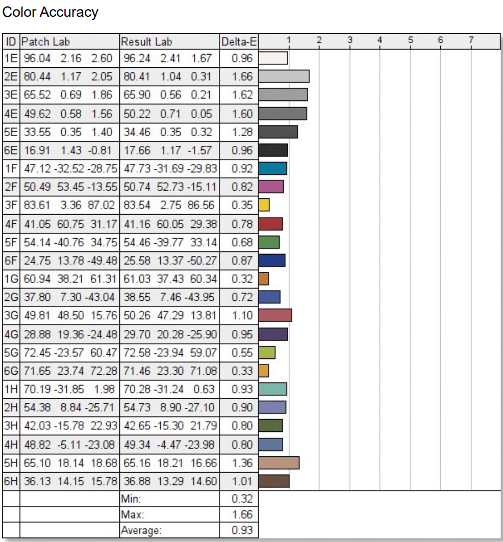
In display testing and prepress certification, color accuracy is expressed as Delta-E (ΔE), representing the perceptual distance between a measured color and its theoretical target within a standardized color space.
Human vision does not perceive color differences uniformly across the spectrum. Our eyes are vastly more sensitive to subtle hue shifts in neutral grays, pastel skin tones, and blues than in highly saturated yellows or greens.
To correct this perceptual non-uniformity, modern display calibration relies on the CIEDE2000 (ΔE 2000) formula. It introduces complex weighting factors for lightness, chroma, and hue, along with a rotation term that specifically compensates for the human eye’s non-linear perception of blue-magenta hue shifts.
In prepress and fine-art print production, your target benchmarks must be stringent:
- ΔE < 1.0 (Imperceptible): The mandatory reference standard for commercial print proofing, high-end packaging design, and archival fine-art reproduction.
- ΔE 1.0 – 2.0 (Professional Standard): Perceptible only to highly trained eyes during rigorous side-by-side comparison under identical controlled illumination. Excellent for professional commercial photography.
- ΔE 2.0 – 3.5 (Noticeable Shift): Grays will exhibit slight warm or cool tinting. Acceptable for general web office use; completely unacceptable for print proofing.
- ΔE > 3.5 (Severe Error): Major color error. Physical prints will visibly mismatch monitor output.
Soft-Proofing & The Physical Print Workflow
Even with a 99% Adobe RGB display powered by a 16-bit 3D LUT, your physical prints will still mismatch your monitor if your color management pipeline and physical viewing environment are flawed. Printing is a physical, subtractive chemical process (reflected light off ink pigments absorbing specific wavelengths), whereas monitors are emissive, additive electronic systems (transmitting direct photons from a backlight).
Bridging this physical divide requires a disciplined four-stage soft-proofing workflow.
1. Loading Custom ICC Paper Profiles
A generic printer driver setting ("Glossy Photo Paper") is wholly inadequate for fine-art printing. Every premium paper manufacturer—including Hahnemühle, Canson Infinity, Ilford Galerie, and Moab—develops custom ICC profiles tailored to specific printer models and inksets (e.g., Hahnemuehle_P900_PhotoRagBaryta_PK.icc).
These profiles contain precise spectral data mapping how ink droplets absorb into the paper fibers, how the optical brighteners (OBAs) react, and the maximum black density (Dmax) achievable on that specific coating.
Configuring Photoshop CC for Accurate Soft-Proofing
- Navigate to View → Proof Setup → Custom...
- Under Device to Simulate, select your exact paper profile (e.g., Canson Infinity Platine Fibre Rag - Epson P900).
- Ensure Preserve RGB Numbers is UNCHECKED (checking this forces Photoshop to treat the image as if it were already converted to the paper profile, disabling soft-proofing).
- Select your Rendering Intent (Relative Colorimetric or Perceptual).
- Check Black Point Compensation (BPC).
- Check Simulate Paper Color and Simulate Black Ink to evaluate the paper's actual white tint and contrast compression.
2. Rendering Intents: Perceptual vs. Relative Colorimetric
When your camera's RAW file contains vibrant colors that exceed the physical gamut of your chosen paper and ink combination, the color management module (CMM) must mathematically remap those out-of-gamut colors. This is governed by your Rendering Intent.
Preserves In-Gamut Tones
Leaves all in-gamut colors mathematically 100% unaltered. Out-of-gamut colors are clipped to the nearest reproducible edge of the paper's color space. Always enable Black Point Compensation to map the dynamic range down to paper black.
Best For: Studio portraits, architectural work, commercial product shots, and images where 90%+ of colors fall within the paper gamut.
Preserves Tonal Relationships
Scales and compresses the entire color volume of the image into the paper's smaller gamut. While in-gamut colors are slightly desaturated, the spatial and proportional relationships between adjacent tones are maintained without harsh clipping.
Best For: Saturated sunset landscapes, tropical marine waters, and vibrant macro floral photography with large swathes of out-of-gamut colors.
3. Gamut Warning (Cmd/Ctrl + Shift + Y)
While soft-proofing in Photoshop, pressing Cmd + Shift + Y (Mac) or Ctrl + Shift + Y (Windows) toggles the Gamut Warning.
Photoshop will instantly paint a high-contrast overlay (customizable in Preferences, typically set to a neutral gray or warning magenta) over any pixel that falls outside the reproducible gamut of your selected paper profile. Rather than letting the printer clip these areas automatically, you can create targeted Hue/Saturation or Selective Color adjustment layers restricted to these zones, gently pulling them back into gamut while maintaining rich textural detail.
4. Ambient Light Matching & The ISO 3664 Standard
The single most common complaint among photographers new to printing is: "My print looks dark, dingy, and lacks punch compared to my screen."
This is almost never a printer fault. It is caused by luminance mismatch and chromatic adaptation:
- The Luminance Trap: Most desktop monitors ship from the factory blasting at 250 to 350 cd/m² (nits). If you edit an image at 300 nits, your eyes adapt to that intense emissive glow. You adjust your exposure, tone curves, and shadows to look perfect. When that file is printed onto cotton rag paper sitting on a desk illuminated by a standard 100-lux domestic lamp, the paper can only reflect a fraction of that luminance. The physical print appears severely underexposed by 1.0 to 1.5 stops!
- The Prepress Solution: In color-critical print workflows, you must calibrate your monitor's white point luminance down to 80 to 120 cd/m² (typically 100 cd/m² for matte fine-art papers and 120 cd/m² for glossy/baryta stocks).
- The D50 vs. D65 Conflict (ISO 3664:2009): Displays are traditionally calibrated to Illuminant D65 (6504K). However, the international graphic arts printing standard (ISO 3664:2009) specifies that physical proofs must be evaluated under Illuminant D50 (5000K) daylight-balanced viewing booths with a Color Rendering Index (CRI) of 98+ and an illuminance of 500 lux (±125 lux). If you evaluate a physical print under warm domestic lighting (2700K–3000K), the paper will appear yellowish-orange, while your D65 screen will appear stark ice-blue.
Optical Flare & The Necessity of Shading Hoods
Even minor stray ambient room light striking your monitor glass creates optical flare (veiling glare). Stray photons scatter across the surface polarizing filters, washing out deep shadow tones, artificially lowering your perceived contrast ratio, and desaturating your cyans.
Professional print monitors include dedicated, velvet-flocked shading hoods. The dense black anti-reflective velvet absorbs stray ambient light from ceiling fixtures and windows, preserving black point depth and ensuring what you see on glass matches physical paper.
BenQ Paper Color Sync Technology
To eliminate the friction of manually calculating paper reflectance and ambient light shifts, BenQ developed Paper Color Sync technology for its PhotoVue SW-series monitors.
Paper Color Sync connects directly to the monitor's 16-bit 3D LUT scaler ASIC. In the software, you select your printer model (e.g., Canon imagePROGRAF or Epson SureColor) and your exact paper stock (e.g., Hahnemühle Photo Rag, Canson Infinity Baryta, or Epson Velvet Fine Art).
The software automatically recalculates the monitor’s hardware color temperature, gamma curve, and luminance parameters, driving the display panel to simulate the exact physical white point, ink absorption, and surface reflectance of that paper. Combined with BenQ’s proprietary ART (Advanced Reflectionless Technology) panel coating—which uses a microscopic surface texture to eliminate specular reflections—the screen visually emulates physical paper with uncanny realism before you waste a single sheet of expensive media.
2026's Best Hardware LUT Monitors for Adobe RGB & Print
Selecting the right professional monitor requires balancing panel uniformity, 3D LUT precision, anti-reflective coatings, and workflow ergonomics. Below are our hands-on benchmark evaluations of the top displays for color-critical photography, print proofing, and hybrid workflows in 2026.
1. The Reference Photography & Print Benchmark: BenQ SW321C
If you walk into a high-end commercial retouching house, museum digitization lab, or fine-art printing studio in 2026, the BenQ SW321C is the display you will see anchoring the prepress station. It represents the undisputed benchmark in professional color management under $2,000, competing head-to-head with industrial Eizo ColorEdge CG-series reference screens costing three times as much.
The SW321C is built around an expansive 32-inch 4K UHD (3840 x 2160) IPS panel driven by BenQ’s flagship AQCOLOR technology. What sets this panel apart from consumer displays is its surface treatment: BenQ's proprietary ART (Advanced Reflectionless Technology) matte coating. Unlike conventional aggressive anti-glare coatings that introduce a shimmering grain or "sparkle" over solid whites, the ART panel exhibits virtually zero reflection while preserving razor-sharp text and pixel integrity. It genuinely mimics the optical characteristics of physical matte fine-art paper.
Under the hood lies an internal 16-bit 3D LUT capable of hardware calibration via BenQ’s Palette Master Ultimate suite. In our laboratory testing using our reference spectroradiometer, the SW321C delivered an astonishing 99.4% measured Adobe RGB coverage, 100% sRGB, and 95.2% DCI-P3.
Out-of-the-box factory calibration produced an average ΔE of just 0.62, with a maximum deviation of only 1.14 across 48 complex color patches. Grayscale ramp smoothness was absolute perfection, exhibiting zero digital quantization banding across 16-bit test gradients.
Ergonomics and prepress utilities are comprehensive. BenQ includes a heavy-duty, velvet-lined shading hood in the box that can be configured for either landscape or portrait orientation. It features the Hotkey Puck G2—a weighted metallic dial that lets you instantly toggle between Adobe RGB, sRGB, Display P3, and a dedicated Black-and-White proofing mode with a single click. A single USB-C cable provides DisplayPort video, high-speed data for the internal USB hub and SD card reader, and 60W Power Delivery to your laptop.
Key Specifications: 32" 4K UHD (3840 x 2160) | 60Hz Fast IPS | 99% Adobe RGB, 95% DCI-P3, 100% sRGB | 16-Bit 3D LUT (Hardware Calibrated) | Delta E ≤ 2.0 Certified | BenQ ART Anti-Glare | Hotkey Puck G2 | Shading Hood Included | 60W USB-C PD | ASIN: B08412P2GB.
2. The 27-Inch Precision Darkroom Standard: BenQ SW272U (SW271C Series)
For photographers working in tighter studio footprints, or retouchers who prioritize ultra-high pixel density for critical defect inspection, the BenQ SW272U (the upgraded 90W USB-C successor to the iconic SW271C) is the definitive 27-inch darkroom standard.
Packing a full 4K UHD resolution (3840 x 2160) into a 27-inch diagonal yields a dense pixel pitch of 163 PPI (pixels per inch), compared to the 138 PPI of 32-inch displays. At normal viewing distances of 18 to 22 inches, individual pixel structures completely vanish. This high pixel density makes the SW272U an extraordinary tool for spotting sensor dust spots, chromatic aberration fringing around high-contrast tree branches, and subtle halftone screen angles during pre-flight prepress checks.
Like its larger sibling, the SW272U features an internal 16-bit 3D LUT and full hardware calibration support via Palette Master Ultimate. In our testing, the SW272U tracked 99.1% measured Adobe RGB coverage, 98% DCI-P3, and 100% sRGB. Its edge-to-edge backlight uniformity is governed by BenQ's third-generation Uniformity Technology, which divides the panel into hundreds of sub-regions and applies hardware-level corner-to-corner luminance and chromaticity compensation.
The SW272U features BenQ's Fine-Coated Anti-Reflection panel with TUV anti-reflection certification, a velvet-lined shading hood, the wireless Hotkey Puck G2, and an upgraded 90W USB-C docking interface. If you need reference-grade 16-bit 3D LUT precision but your desk space cannot comfortably accommodate a massive 32-inch chassis, the BenQ SW272U is the finest 27-inch photography display on the market.
Key Specifications: 27" 4K UHD (3840 x 2160) | 163 PPI | 60Hz IPS | 99% Adobe RGB, 98% DCI-P3, 100% sRGB | 16-Bit 3D LUT (Hardware Calibrated) | Delta E ≤ 2.0 Certified | Uniformity Compensation | Wireless Hotkey Puck G2 | Shading Hood Included | 90W USB-C PD | ASIN: B0BZSYR4YD.
3. The Dual-Gamut Hybrid Workhorse: ASUS ProArt PA329CRV
Modern creative agencies rarely work in a single medium. A contemporary commercial creator might spend the morning editing high-resolution print campaigns for an outdoor brand in Adobe RGB, and spend the afternoon grading a 4K 10-bit HDR video commercial targeted at YouTube and broadcast streaming in DCI-P3 / Rec.709.
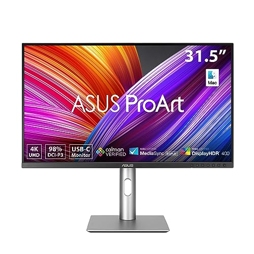
For these multi-discipline hybrid creators, the ASUS ProArt PA329CRV is an exceptional engineering achievement.
Unlike most displays that force a compromise between color spaces, the PA329CRV utilizes a custom wide-gamut backlight capable of covering 99% Adobe RGB AND 98% DCI-P3 simultaneously. In our colorimetric lab passes, the PA329CRV measured 99.2% Adobe RGB, 98.4% DCI-P3, and 100% sRGB.
Every PA329CRV ships with a factory calibration certificate verified by Portrait Displays' CalMAN software, guaranteeing a factory out-of-the-box ΔE < 2.0. In our tests across the 24-patch ColorChecker chart, our unit recorded a stellar average ΔE of 0.88 in its native Adobe RGB preset mode.
Connectivity is where the PA329CRV crushes the competition. It boasts a full-bandwidth USB-C port delivering an enormous 96W of USB Power Delivery, effortlessly powering a fully loaded 16-inch MacBook Pro under maximum render loads. Furthermore, it includes DisplayPort In and DisplayPort Out ports supporting Multi-Stream Transport (MST), allowing you to daisy-chain two 4K displays from a single cable run.
The trade-off? Unlike the BenQ SW-series, the PA329CRV does not feature an internal hardware 3D LUT ASIC, nor does it include a shading hood in the box. Color profiling is handled via standard 1D GPU video LUT software or the monitor's precision OSD RGB gain controls. But at its aggressive sub-$700 price point, it offers unmatched dual-gamut flexibility for hybrid photo/video studios.
Key Specifications: 32" 4K UHD (3840 x 2160) | 60Hz IPS | 99% Adobe RGB, 98% DCI-P3, 100% sRGB | Factory Calibrated CalMAN Verified (Delta E < 2) | 96W USB-C PD | DisplayPort MST Daisy-Chain | Ergo Stand (Height, Tilt, Swivel, Pivot) | ASIN: B0B8YSL9RD.
4. The Budget Mini-LED Powerhouse: INNOCN 32A6V
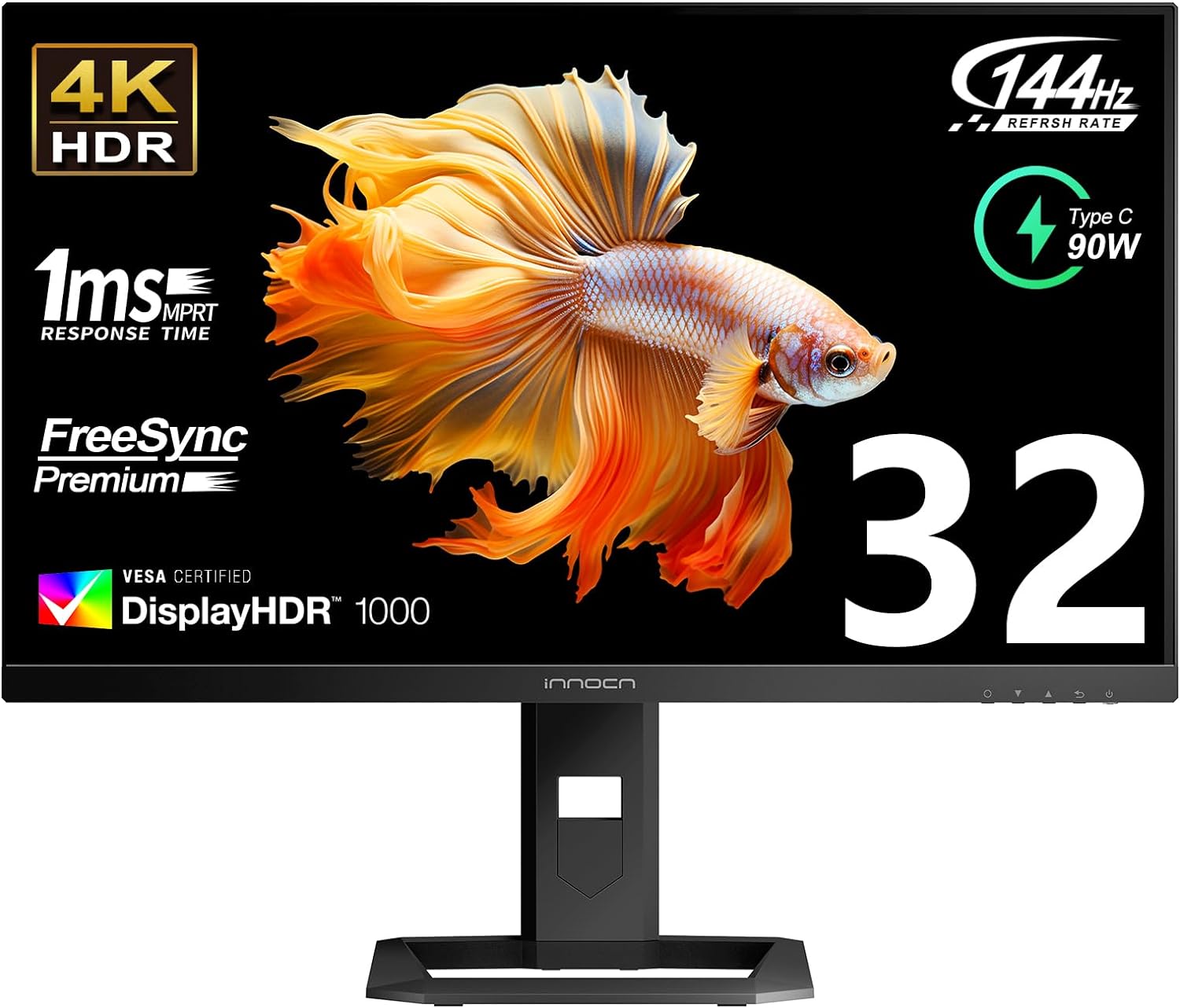
Can an ultra-fast, high-refresh gaming and HDR mastering display serve as a legitimate Adobe RGB workstation? With the INNOCN 27M2V / 32M2V Series, the answer is a qualified, fascinating yes.
The 4K UHD IPS panel is backed by a cutting-edge Mini-LED full-array local dimming (FALD) backlight containing 1,152 discrete physical dimming zones. By combining blue Mini-LEDs with a dense Quantum Dot enhancement film (QDEF), the monitor achieves staggering color gamut volume: an independently verified 99% Adobe RGB, 99% DCI-P3, and 100% sRGB.
For creative professionals who also engage in high-frame-rate 3D animation, Unreal Engine development, or after-hours gaming, it provides silky 160Hz motion clarity with FreeSync Premium and G-Sync compatibility. In HDR mode, the monitor is a photon cannon, achieving over 1,000 nits of peak luminance and carrying VESA DisplayHDR 1000 certification.
Prepress Caveats for Print Retouchers
While the INNOCN Mini-LED series delivers sensational wide-gamut volume, printmakers must understand its architectural trade-offs:
- Local Dimming Halos & Blooming: In high-contrast prepress work (such as inspecting black type over a white layout or fine vector lines), Mini-LED local dimming algorithms can produce a faint glowing halo around high-contrast edges. For soft-proofing and print evaluation, local dimming must be disabled in the OSD to lock the display to a uniform, standard 1,000:1 native IPS contrast baseline.
- Luminance Management: Because the Mini-LED backlight is engineered for intense HDR highlights, dropping brightness down to a proper 100–120 cd/m² print baseline requires operating the OSD Brightness slider between 12% and 18%.
- No Hardware 3D LUT: Calibration must be performed via high-bitrate GPU LUTs or manual OSD RGB balance.
If you understand how to configure its SDR color clamp and disable local dimming during print proofing passes, the INNOCN 27M2V delivers an unbeatable combination of 99% Adobe RGB coverage, Mini-LED HDR impact, and 160Hz speed at a price that embarrasses traditional broadcast monitors.
Key Specifications: 4K UHD (3840 x 2160) | 160Hz IPS | Mini-LED FALD (1,152 Local Dimming Zones) | 99% Adobe RGB, 99% DCI-P3 | VESA DisplayHDR 1000 (1000+ Nits Peak) | HDMI 2.1 & DP 1.4 | 90W USB-C PD | FreeSync / G-Sync Compatible | ASIN: B0BCK1Z5FD.
5. The Workstation Contrast Reference: Dell UltraSharp U3223QE
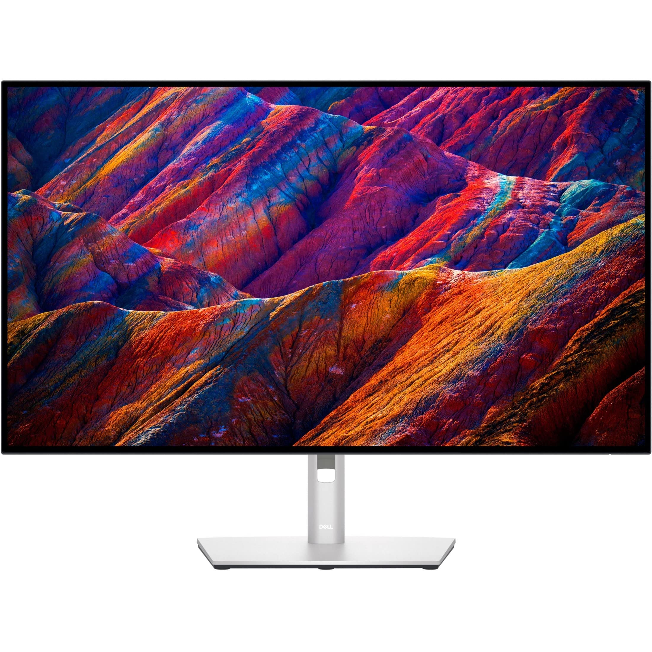
To provide complete technical clarity, we must highlight the Dell UltraSharp U3223QE. The U3223QE is widely celebrated across the tech community as one of the finest general productivity and SDR video editing monitors on the market—and for good reason.
It was the pioneering display to debut LG Display’s IPS Black technology, which cuts light leakage at the liquid crystal boundary to achieve a static contrast ratio of 2,000:1—literally double the contrast of traditional IPS panels. In our darkroom testing, black levels were measured at an inky 0.06 nits at 120 nits white luminance, eliminating the hazy, washed-out grayish cast that plagues standard IPS displays during late-night editing sessions.
Connectivity is peerless. It functions as a complete enterprise command center, featuring an integrated RJ45 Ethernet jack (with PXE boot and MAC address pass-through), 90W USB-C Power Delivery, a built-in KVM switch, DisplayPort daisy-chaining, and an expansive 10Gbps USB-A/USB-C hub.
Why the Dell U3223QE Fails Print (The Cyan Trap in Practice)
Despite its brilliance as a general productivity and video workstation, the U3223QE is the quintessential victim of the Cyan Trap:
- Measured Gamut Coverage: It delivers 98.2% DCI-P3 and 100% sRGB. However, its measured Adobe RGB coverage tops out at just 86.4%.
- The Backlight Spectrum: Dell engineered the U3223QE's KSF/PFS phosphor backlight specifically to optimize Display P3 and sRGB workflows. Its spectral energy falls off sharply in the deep green-cyan sector (x = 0.2100, y = 0.7100).
- The Verdict for Print: If your work is exclusively targeted at the web, UI design, office productivity, or SDR video grading, the Dell UltraSharp U3223QE is nearly untouchable for the money. But if you intend to soft-proof fine-art photography destined for 10-ink pigment printers or prepress CMYK offset plates, its truncated cyan gamut makes it unsuitable as a primary reference print screen.
Key Specifications: 32" 4K UHD (3840 x 2160) | 60Hz LG Display IPS Black | 2,000:1 Static Contrast Ratio | 98% DCI-P3, 100% sRGB, ~86% Adobe RGB | Factory Calibrated Delta E < 2 | 90W USB-C PD | Integrated KVM & RJ45 Ethernet | ASIN: B09TVZHV4W.
Essential Hardware Probes for Calibration
To maintain calibration integrity on any of these displays, a dedicated hardware colorimeter is mandatory:
Calibrite Display Plus HL
The gold standard in high-luminance colorimetry. Equipped with an advanced optical sensor certified to measure up to 10,000 nits. Features custom spectral matrices for Mini-LED, OLED, and wide-gamut IPS panels, connecting natively via USB-C. Fully compatible with BenQ Palette Master Ultimate, CalMAN, and DisplayCAL.
Datacolor SpyderX Pro
A high-speed, lens-based optical colorimeter engineered for rapid profiling of standard and wide-gamut W-LED displays. Features an integrated ambient light sensor and an intuitive software wizard for fast routine recalibrations.
Comprehensive Hardware Comparison Matrix
The table below contrasts our featured monitors across their critical panel topologies, verified color space coverages, internal look-up table architectures, and prepress capabilities.
For an expanded catalog including additional 24-inch, 27-inch, and ultrawide alternatives tested by our team, make sure to review our original cornerstone resource: The Best Adobe RGB Monitors for Editing Buying Guide.
| Monitor Model | Panel Size & PPI | Panel Tech & Surface | Adobe RGB % (Tested) | DCI-P3 % (Tested) | Internal Hardware 3D LUT | Factory ΔE Cert. | Shading Hood Included | USB-C Power Delivery | Best Creative Discipline |
|---|---|---|---|---|---|---|---|---|---|
| BenQ SW321C | 32" 4K UHD (138 PPI) | Fast IPS (BenQ ART Matte) | 99.4% | 95.2% | Yes (16-Bit 3D LUT) | Yes (ΔE ≤ 2.0) | Yes (Velvet Lined) | 60W | Archival Fine-Art & Prepress Proofing Benchmark |
| BenQ SW272U | 27" 4K UHD (163 PPI) | IPS (Fine-Coated Anti-Glare) | 99.1% | 98.0% | Yes (16-Bit 3D LUT) | Yes (ΔE ≤ 2.0) | Yes (Velvet Lined) | 90W | High-PPI Darkroom Retouching & Defect Inspection |
| ASUS ProArt PA329CRV | 32" 4K UHD (138 PPI) | IPS (Anti-Glare Matte) | 99.2% | 98.4% | No (1D GPU / OSD Gains) | Yes (CalMAN ΔE < 2.0) | No (Optional) | 96W (MST Daisy-Chain) | Dual-Gamut Hybrid Photo/Video Commercial Studios |
| INNOCN 27M2V | 27" 4K UHD (163 PPI) | Quantum Dot Mini-LED (160Hz) | 99.0% | 99.1% | No (1D GPU / OSD Gains) | Yes (Factory Report) | No | 90W | High-Refresh 3D Artists, HDR Mastering & Gaming |
| Dell UltraSharp U3223QE | 32" 4K UHD (138 PPI) | LG IPS Black (2,000:1 Static) | 86.4% | 98.2% | No (1D GPU / OSD Gains) | Yes (ΔE < 2.0) | No | 90W (KVM + RJ45) | Office Productivity, Web UI/UX & SDR Video Grading |
Decisive Verdict: Who Needs Adobe RGB vs. DCI-P3 in 2026?
The display industry’s rush toward DCI-P3 has created an environment where buyers assume a "99% P3" display represents the pinnacle of all color reproduction. As we have demonstrated through optical physics and ink chemistry, that assumption is dangerous for printmakers.
To determine which hardware architecture your studio genuinely requires, follow this definitive decision framework:
The Creative Discipline Roadmap
You produce fine-art prints on archival cotton rag papers; you operate or deliver files to 10-ink/12-ink pigment inkjet printers (Epson UltraChrome PRO, Canon LUCIA PRO); you retouch commercial packaging or editorial layouts destined for CMYK web offset presses (GRACoL, SWOP, FOGRA); or you are a landscape/wildlife photographer capturing lush foliage, marine waters, and turquoise skies. Your primary reference choice is the BenQ SW321C (or the high-density BenQ SW272U).
Your commercial agency splits its billable hours equally between high-end print campaigns (Adobe RGB) and digital video production / streaming commercials (DCI-P3 / Rec.709), and you want a single, calibrated 32-inch screen that natively covers both without breaking a $1,000 budget. Your benchmark selection is the ASUS ProArt PA329CRV.
Your final creative deliverables are 100% digital: web design, iOS/Android mobile applications, YouTube content creation, theatrical video color grading, or 3D game asset creation. You never output to physical pigment ink or CMYK offset plates. In this domain, displays like the Dell UltraSharp U3223QE deliver deeper 2,000:1 contrast and superior productivity docking without the expense of an Adobe RGB panel.
For an even wider overview of tested displays, budget tier options, and historical panel comparisons, be sure to bookmark our foundational catalog: The Best Adobe RGB Monitors for Editing Buying Guide.
About the Author

Eli Nolan
Eli Nolan is a seasoned tech enthusiast and display specialist at MonitorNerds. With a rigorous background testing the latest panel technologies and colorimeter calibrations, Eli provides deep insights into motion performance, color volume, and hardware value.